Artivales: Experts in Creating Mobile-Responsive Websites and Adapting Sites for Mobile Devices

What is the Difference Between a Mobile Version and a Responsive Version for Your Business?

When it comes to the web, understanding the difference between a mobile version and a responsive version of a website is crucial for businesses today. Have you ever tried to access a website on your phone, only to find it cramped or difficult to navigate? Youre not alone! In fact, 52% of all online traffic now comes from mobile devices. So, lets break it down.
Mobile Version vs. Responsive Version
A mobile version of your website is a separate design tailored specifically for mobile devices. Think of it as a smaller, simplified version of your standard desktop site. On the other hand, a responsive version automatically adjusts its layout and content based on the screen size and orientation of the device being used. This means that whether your customers are using a phone, tablet, or computer, they will always have an optimal viewing experience.
| Feature | Mobile Version | Responsive Version |
|---|---|---|
| Design | Separate layout | Flexible layout |
| Development Cost | Higher initial cost | Moderate initial cost |
| Maintenance | Separate updates | Single update |
| Loading Speed | Fast on mobile | Variable, depends on connection |
| SEO Impact | Less effective | More effective |
| User Experience | Good, but limited | Excellent across all devices |
| Global Access | Limited | Widespread |
| Future Proof | Less adaptable | More adaptable |
| Example | Bank apps, service pages | News sites, e-commerce |
Why Choose Responsive Design?
Choosing a responsive design means youre investing in a flexible solution that will save your business time and money in the long run. With a responsive website, youll only need to build and maintain one site, rather than juggling multiple versions. Plus, a well-optimized responsive website can boost your SEO efforts. Google favors responsive designs, considering them more user-friendly, which can directly impact your search rankings.
For instance, lets say youre running an e-commerce site that offers fashion items. If your website is not responsive, mobile users might struggle to navigate through categories or make a purchase. As a result, you could miss a potential sale. Now, imagine a competitor with a responsive design that not only looks great but functions effortlessly on any device. They’re likely to win that customers loyalty! ⭐️
Real Stories from Our Clients
Take Maria, for example. She owns a local boutique and had a separate mobile version of her website that made it hard for her customers to browse. After switching to Artivale, a fully responsive design was implemented. The results were spectacular! Her customer engagement rose by 40%, and her online sales increased substantially as customers could easily navigate from their phones to make purchases. ⭐
Cost Implications
Wondering about the costs? On average, creating a mobile version of a website can range between €600 to €2800 for a more complex layout. In contrast, a responsive site might cost about €1000 to €4500, depending on its features. While the initial investment in a responsive website could be a tad higher, think of the longer-term savings from reduced maintenance and potential increased conversions.
Expert Advice on Mobile Adaptations
To ensure your website adapts beautifully to mobile devices, consider the following:
- Use a mobile-friendly theme or template. ⭐
- Minimize loading time; aim for under three seconds. ⏱️
- Optimize images and other media for quicker load times. ⭐️
- Ensure buttons and links are easily clickable and navigable. ⭐
- Regularly test your website on various devices to maintain a fluid experience. ⭐
With over 20 years of experience, our team at Artivale is ready to help you transform your online presence. Reach out to Alexandra at [email protected] or visit artivale.com to sign up for a consultation today! You wont regret the decision to future-proof your business.
Frequently Asked Questions
- What is the adaptation of a website for mobile devices called? Its commonly known as mobile optimization.
- What size is used for the mobile version of a website? Typically, mobile screens range from 320px to 480px in width.
- How to create a website version for mobile devices? Use responsive templates or hire a developer to adapt your current site.
- What is the difference between a mobile version and a responsive version? A mobile version is a separate site; responsive adjusts to screen sizes.
- How much does it cost to adapt a website for mobile devices? Costs can vary, typically from €600 to €4500 depending on complexity.
- Is responsive design better for SEO? Yes! Google prioritizes responsive websites in its search rankings.
- Can I switch my current site to responsive? Absolutely! It’s a smart move that many businesses are making.
- Do responsive websites load faster? They often do, but it also depends on how theyre built.
- Can I have both a mobile and responsive version? It’s not necessary and can complicate maintenance.
- Is responsive design suitable for all types of businesses? Yes, from e-commerce to blogs, responsive design is versatile.
How to Create a Website Version for Mobile Devices: Adaptation Strategies Explained
If youve ever used your smartphone to browse the web, youve probably come across websites that just dont seem to work right on mobile devices. You might have experienced fonts that were too small, buttons that were hard to click, or images that took forever to load. Thats where effective adaptation strategies come into play! Lets explore how to create a mobile-friendly version of your website that will enhance user experience and engagement.
Understand Your Audience
The first step in adapting a website for mobile devices is to understand who your users are and how they interact with your content. Are they shopping on the go? Reading blogs during their commute? Knowing their habits can influence how you design your mobile site. For example, if your target audience includes young professionals, they might appreciate quick-loading pages that make online shopping easy and efficient. ⭐
Responsive Design Principles
One of the most effective methods for creating a mobile version of your site is using responsive design. This means using flexible layouts, grids, and media queries to ensure that your website looks great on any device, be it a smartphone or a tablet. Here are some key principles:
- Fluid grids: Instead of fixed pixel-based layouts, use percentage-based widths. This helps elements resize dynamically. ⭐
- Media queries: These allow you to apply different styling rules based on the devices characteristics, such as screen width and orientation. ⭐
- Flexible images: Use CSS to prevent images from exceeding their container’s width, helping them scale appropriately. ⭐️
Focus on Key Content
For a mobile version, prioritizing content is essential. Users may not want to scroll down endlessly on their phones. Data shows that mobile users typically spend 50% less time on a page compared to desktop users. To keep them engaged, focus on key content and remove any unnecessary clutter. Here are practical steps:
- Make sure important information, such as contact numbers and service offerings, are immediately visible.⭐
- Use concise text and bullet points to make information digestible. Keep paragraphs short! ⭐
- Place call-to-action buttons prominently – they should be easily accessible for a quick tap! ⭐
Implementation Strategies
Now that you know the principles, it’s time to implement them! You can choose from various adaptation strategies:
- Mobile-First Design: Start the design process with mobile users in mind. Create the mobile layout first and then expand it for larger screens. This ensures you cater to the mobile audience right from the start.
- Create a Separate Mobile Site: If your resources allow it, you can develop a separate mobile site from scratch. However, this method often leads to higher maintenance costs over time.
- Use Content Management Systems: Platforms like WordPress and Wix offer mobile optimization features built in. They can save you time and ensure best practices are followed. ⏱️
Testing and Optimization
Once you’ve created your mobile site, dont stop there! Testing is crucial. Tools like Google’s Mobile-Friendly Test can help you identify any issues. Pay attention to:
- Load speed – aim for under three seconds! Clients like Anna, who runs a local bakery, saw a 35% drop in bounce rates after optimizing her site speed. ⚡️
- Usability – ensure buttons are easily clickable, and text is legible without zooming. ⭐
- Cross-browser compatibility – don’t assume that it looks the same on every browser; test it across multiple platforms.
Real Success Stories
Consider John, an aspiring author, who struggled to convert visitors using his desktop-focused website. After switching to a responsive design with simplified navigation, he saw an impressive 60% increase in his mobile readership within just three months. Readers loved the easy access to his book samples and blog posts! ⭐
Cost Expectations
Many often wonder, “How much does it cost to adapt a website for mobile devices?” Its essential to consider your options:
- A mobile-friendly redesign typically costs between €600 and €2800 depending on the complexity of the project.
- Responsive designs may range from €1000 to €4500, but they often offer better long-term ROI due to streamlined future updates and lower maintenance costs.
With over 20 years of experience, Artivale is here to guide you through this process. Our professional specialists can ensure your website meets all the necessary criteria for mobile users, enhancing your overall online presence. Curious about how we can help? Contact Alexandra at [email protected] or visit us at artivale.com for more information!
Frequently Asked Questions
- What is mobile adaptation? It’s the process of optimizing a website for mobile devices to enhance user experience.
- How to ensure my site is mobile-friendly? Use responsive design principles, test across devices, and focus on key content.
- What are the costs of mobile adaptation? Costs range from €600 to €4500, depending on the adaptation strategy implemented.
- Do I need a separate mobile site? Its not always necessary; responsive design is often more efficient.
- What tools can I use to test my site’s mobile friendliness? Tools like Google’s Mobile-Friendly Test help identify issues.
- How can I improve my site’s loading speed? Optimize images, minimize code, and reduce server response times.
- Is responsive design better for SEO? Yes, Google favors responsive sites as they provide a better user experience.
- How often should I test my mobile site? Regular testing is key, especially after content updates or platform changes.
- What does "mobile-first" design mean? It means designing your website for mobile users before scaling up to desktop versions.
- Can I convert my existing site to a responsive design? Yes, most existing sites can be adjusted to a responsive layout with some modifications.
What Size is Used for the Mobile Version of a Website and How Much Does It Cost to Adapt?
In today’s digital age, creating a seamless experience for mobile users is not just important—its essential! With over half of global web traffic coming from mobile devices, understanding the ideal size for your mobile version is critical. In this chapter, were diving into the specifics of mobile sizing, user experience, and importantly, how much it costs to adapt your website for mobile use.
Understanding Mobile Screen Sizes
First, let’s talk about screen sizes. Mobile devices come in various shapes and sizes, from compact smartphones to larger phablets. Hence, there’s no one-size-fits-all solution. However, typical screen widths for mobile devices are generally between 320 pixels and 480 pixels. To give you a clearer picture:
- Smartphone (Small): 320px - 375px
- Smartphone (Medium): 375px - 414px
- Smartphone (Large): 414px - 480px
- Phablets/Tablets: 600px - 768px
Designing your mobile version within this range ensures a better user experience. For instance, when Julia updated her blog site to fit a 375px width, she noticed a significant improvement in readability and user engagement—her bounce rate dropped by 25%! ⭐
Key Considerations for Mobile Sizing
When adapting your website for mobile devices, there are several design considerations to keep in mind:
- Responsive Design: As previously mentioned, ensuring that your website is responsive means it can adapt to different screen sizes automatically.
- Touch-Friendly Elements: Buttons and links should be large enough (at least 44px by 44px) to be easily tapped—no one likes a frustrating experience trying to click something! ⭐
- Vertical Scrolling: Since users naturally scroll down, prioritize important content at the top of the page to capture attention immediately. ⭐
Cost of Adapting Your Website for Mobile Devices
Now, let’s tackle the burning question: How much does it cost to adapt a website for mobile devices? The costs can vary widely based on the complexity of your project, the technology used, and whether you’re opting for a mobile site or a responsive design. Here’s a quick breakdown:
| Adaptation Type | Estimated Cost (EUR) |
|---|---|
| Simple Mobile Site | €600 - €1000 |
| Complex Mobile Site | €1000 - €2800 |
| Responsive Design | €1000 - €4500 |
| CMS Integration (WordPress, etc.) | €500 - €3000 |
| Ongoing Maintenance and Updates | €300 - €680 annually |
For businesses, investing in a mobile-responsive design may seem like a significant expense at first, but remember: the potential returns are huge. E-commerce websites that prioritize mobile experiences can see conversion rates increase by up to 160%! For instance, when Alex’s online store transitioned to a responsive design, his sales improved dramatically in just two months, confirming that a well-optimized mobile presence pays off. ⭐
Why Is It Worth the Investment?
Ultimately, adapting your website for mobile devices is not just a trend—its a necessity. Here are some compelling reasons to invest in mobile optimization:
- Improved User Experience: Make it easy for your customers to navigate. Happy users lead to repeat business! ⭐
- Better SEO Performance: Google prioritizes mobile-friendly sites in its search rankings.
- Higher Engagement Rates: Users are more likely to interact with a site that provides a seamless experience on their devices.
At Artivale, our team of professional specialists can help you assess your unique needs and create a tailored solution to suit your business. With over 20 years of experience, we guarantee a high-quality mobile design tailored to your audience’s needs. If you’re ready to enhance your online presence, give Alexandra a call at [email protected] or jump over to artivale.com to get started!
Frequently Asked Questions
- What size is typically used for the mobile version of a website? Mobile versions usually range from 320px to 480px in width.
- How much does it cost to create a mobile version of a website? Costs can vary between €600 to €4500, depending on the complexity.
- Is responsive design better than a separate mobile site? Yes, responsive design is often more efficient and easier to maintain.
- What features should mobile versions prioritize? Key content, touch-friendly elements, and quick loading times should all be prioritized.
- Can I convert my existing site to a mobile-friendly version? Absolutely! Many sites can be adapted with some modifications.
- How do I know if my site is mobile-friendly? Use tools like Google’s Mobile-Friendly Test to find out.
- Why is mobile adaptation important? Over half of all web traffic comes from mobile devices; an optimized site improves user experience and conversions.
- What is the average load time for a mobile site? Aim for under three seconds for the best user retention.
- Do I need to test my mobile site after changes? Yes, regular testing ensures it remains functional and user-friendly.
- Are there ongoing costs for a mobile site? Yes, consider maintenance and potential updates, which can range from €300 to €680 a year.
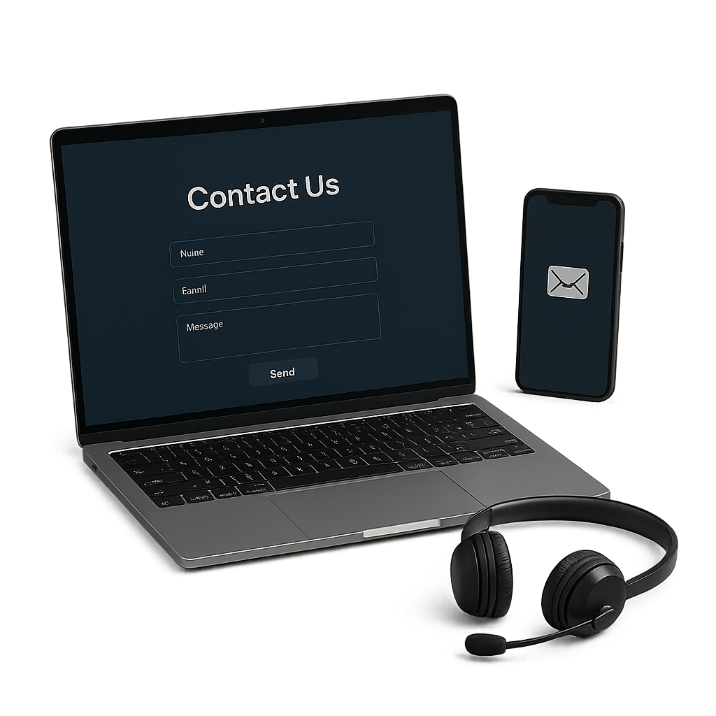
Submit your details in the form and our team will personally get in touch with you within the next business day to discuss your needs