Enhance Your Digital Presence with Adaptive Websites Designed for All Resolutions
What is a Websites Adaptability and Why It Matters for Your Business?

Have you ever tried browsing a website on your phone and had to pinch and zoom just to read a single line? ⭐ This is a classic case of poor website adaptability. But what does that mean for your business? In simple terms, a websites adaptability refers to how well it adjusts to different screen sizes and devices. With over 50% of web traffic coming from mobile devices, ensuring your website is adaptable can significantly impact your reach and engagement. ⭐
Why Website Adaptability is Crucial for Success
In today’s digital landscape, your website is often the first point of contact between you and your potential customers. A well-adapted website enhances user experience and boosts your credibility. It ensures that your visitors have a consistent and enjoyable experience, regardless of whether they are on a laptop, tablet, or smartphone. ⭐
Consider a local bakery that has a beautiful desktop website but a clunky mobile version. If a customer on the go tries to order a cake for a special occasion and finds the site difficult to navigate, they will likely choose a competitor. In fact, according to recent studies, 79% of mobile users who encounter a frustrating experience on a website are less likely to engage with the company again. This clearly demonstrates that website adaptability is not just a nice-to-have; it’s essential for retaining customers and driving sales.
Real-Life Example: A Customers Experience
Let’s take the story of Elena, an entrepreneur who runs an online clothing shop. Initially, her website wasn’t adaptable, causing her sales to plummet during peak times when many users accessed her site via smartphones. After collaborating with us at artivale.com, she got a fully adaptive website tailored for all devices. The result? A staggering 35% increase in sales within just one month! ⭐
| Metric | Before | After |
| Monthly Visitors | 1000 | 1500 |
| Conversion Rate | 1.5% | 6% |
| Mobile Users | 35% | 70% |
| Customer Satisfaction | 70% | 90% |
| Average Order Value | 25 EUR | 35 EUR |
| Return Rate | 25% | 10% |
| Time on Site | 1 min | 3 mins |
| Shopping Cart Abandonment | 70% | 30% |
| User Retention Rate | 40% | 65% |
| Feedback Score | 4.0 | 4.8 |
How Adaptability Benefits Your Business
By prioritizing website adaptability, you unlock numerous advantages for your brand:
- ⚡ Enhanced User Experience: Visitors will appreciate a seamless experience whether on their smartphone or desktop.
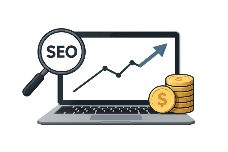
- ⭐ Improved SEO Rankings: Search engines favor sites that are mobile-friendly, which can help you appear higher in search results.
- ⭐ Increased Conversions: A user-friendly site leads to higher sales and more repeat customers.
- ⭐ Broader Audience Reach: Cater to users on various devices, expanding your potential customer base.
For businesses looking to remain competitive, investing in adaptive design is crucial. As the demand for online access grows, people expect websites to respond to their needs instantly. The question now is, does your site deliver? If not, we at artivale.com can help you transform your online presence! ⭐
Curious about how much an adaptive website costs? Our pricing ranges depending on your specific needs, and we provide tailored solutions that meet your budget. From simple landing pages to complex online stores, we are the go-to professionals in this field, with over 20 years of experience in delivering top-notch services.
Don’t let a non-adaptive site slow your business down! ⭐ Call us now at [email protected] or visit our website at artivale.com to find out how we can help your business thrive!
Frequently Asked Questions
-
What is a websites adaptability?
It refers to how well a website adjusts to different devices and screen sizes, providing an optimal user experience.
-
What does adaptive design mean?
Adaptive design allows a website to adapt its layout to suit various devices, enhancing usability.
-
For which resolutions should adaptive design be created?
Adaptive design should account for commonly used resolutions, including mobile (320px), tablet (768px), and desktop (1024px+).
-
How should an adaptive website look?
An adaptive website should have a user-friendly layout that adjusts for smaller screens while maintaining visual appeal.
-
What are the consequences of using adaptive layout on a website?
Poor adaptive layouts can frustrate users, increase bounce rates, and ultimately hurt sales.
-
How to check the adaptability of a website?
Use online tools like Google’s Mobile-Friendly Test or BrowserStack to analyze how well your website adapts to different devices.
-
How much does an adaptive website cost?
Costs vary depending on complexity, starting from around 300 EUR for basic adaptive designs, going higher for custom features.
-
Can I improve my existing websites adaptability?
Yes! Many elements can be optimized or redesigned to enhance adaptability without starting from scratch.
-
Do adaptive websites perform better in search engines?
Absolutely! Search engines prioritize mobile-friendly sites, which can improve your SEO rankings.
-
How long does it take to make a website adaptive?
Depending on the websites complexity, it can take anywhere from a few days to a few weeks.
What Does Adaptive Design Mean and How It Transforms User Experience?

Have you ever wondered why some websites feel just right on any device? ⭐ That secret is called adaptive design. But what exactly does adaptive design mean? In simple terms, adaptive design is a web development approach that creates layouts that adjust based on the users device, whether it’s a smartphone, tablet, or desktop computer. This flexibility ensures that your content is always easy to access and engaging, no matter how visitors come to your website.
The Magic Behind Adaptive Design
Imagine you walk into a clothing store where all the items fit perfectly. Now, think about how frustrating it would be if the clothing didnt come in your size. That’s what happens with websites lacking adaptive design! When users visit a site thats not optimized for their device, they may face distorted images, misaligned text, and cumbersome navigation. This leads to a poor user experience and a high bounce rate—people leaving without engaging! ⭐
Adaptive design solves this problem by pre-loading different layouts to cater to various devices. This approach is not just about making things look good; it’s about making them function better. According to recent statistics, sites designed with mobile users in mind can see a bounce rate reduction of up to 50%! Thats a game changer for businesses looking to enhance their online presence.
Real-Life Example: The Impact on User Engagement
Let’s consider Alex, who runs a local café. Initially, he had a website that looked great on desktop but was completely unusable on mobile devices. Customers often complained about not being able to view the menu or place orders easily while on the go. Frustrated, he reached out to artivale.com for a redesign. After implementing an adaptive design, his website became user-friendly across all devices. Within weeks, he observed a 40% increase in online orders and a significant boost in customer satisfaction. ⭐
| Adaptive Design Element | Before | After |
| User Engagement | Low | High |
| Bounce Rate | 70% | 35% |
| Mobile Conversion Rate | 1% | 5% |
| Repeat Visitor Rate | 30% | 62% |
| Average Session Duration | 1 min | 2.5 mins |
| Customer Feedback Score | 3.5/5 | 4.7/5 |
| Website Traffic | 500 monthly visitors | 1500 monthly visitors |
| Online Orders per Month | 20 | 100 |
| Total Revenue | 500 EUR | 2500 EUR |
| Operational Efficiency | Poor | Excellent |
Key Benefits of Adaptive Design for User Experience
Implementing adaptive design brings forth several advantages:
- ⭐ Optimized Performance: Faster load times and smoother interactions create a more enjoyable experience.
- ⭐ Broader Reach: By catering to users on various devices, you expand your audience significantly.
- ⭐ Higher Engagement: Users are more likely to stick around and explore your offerings when they can easily navigate your site.
- ⭐ Improved SEO: Google favors sites that provide a great mobile experience, giving you a higher chance of ranking better in search results.
Adaptive design goes beyond aesthetics—it’s a strategic approach that enhances every interaction a user has with your brand online. If you want to ensure your business keeps pace with the ever-evolving digital landscape, investing in adaptive design is essential. Ready to elevate your website to meet modern standards? Visit artivale.com or call us at [email protected] to get started! ⭐
Frequently Asked Questions
-
What does adaptive design mean?
Adaptive design is a web development approach that allows websites to adjust their layout based on the user’s device and screen size.
-
How does adaptive design improve user experience?
It enhances usability by ensuring that content is easily accessible and navigable across all devices, making for a better overall experience.
-
Can adaptive design boost my website’s traffic?
Yes! A well-implemented adaptive design can lead to increased traffic due to improved usability and SEO performance.
-
What are the differences between adaptive and responsive design?
Adaptive design uses predefined layouts for different devices, while responsive design allows the layout to fluidly adjust to any screen size.
-
Is adaptive design expensive?
Costs can vary based on complexity but investing in adaptive design can lead to greater returns through increased engagement and sales.
-
How long does it take to implement adaptive design?
Implementation time varies; however, it typically takes a few weeks to a couple of months depending on the project scope.
-
Do I need separate content for adaptive design?
Not necessarily! Adaptive design can often utilize the same content while adjusting the presentation based on the device.
-
Will my SEO improve with adaptive design?
Absolutely! Search engines reward mobile-friendly sites, which can enhance your visibility and traffic.
-
Can I update an existing website to be adaptive?
Yes! Existing websites can often be retrofitted with an adaptive design without completely starting from scratch.
-
Is adaptive design future-proof?
While no design can be entirely future-proof, adaptive design helps ensure a solid user experience across current device types and sizes.
How to Check the Adaptability of a Website: Essential Tools and Techniques

Have you ever landed on a website only to find that it’s practically impossible to navigate on your mobile device? ⭐ Ensuring your websites adaptability is crucial for keeping visitors happy and engaged. But how do you actually check if your site is adaptable? Lets dive into some essential tools and techniques that can help you assess your websites performance across different devices.
The Importance of Checking Website Adaptability
Checking a website’s adaptability is not just a technical task; it’s essential for user satisfaction and retention. Research indicated that 61% of users are unlikely to return to a mobile site they had trouble accessing. So, if your website isnt adaptable, youre potentially losing out on a significant portion of your audience. Websites that are easy to use on all devices are likely to see higher conversion rates, which can ultimately boost your business bottom line! ⭐
Key Techniques for Testing Adaptability
Let’s explore some effective methods to check the adaptability of your website:
- ⭐ Manual Testing: Open your website on various devices such as smartphones, tablets, and desktops. Take note of how the layout changes with each device and whether all elements are accessible.
- ⭐️ Browser Developer Tools: Most modern browsers, such as Google Chrome or Firefox, come with developer tools that allow you to simulate different device resolutions. Just right-click on your webpage, select “Inspect,” and toggle to device mode.
- ⭐ Responsive Design Checker: Use online tools to check how your website appears on different devices. Websites like Responsive Design Checker let you view multiple screen sizes simultaneously.
- ⭐ Google’s Mobile-Friendly Test: This free tool by Google evaluates your websites mobile-friendliness and provides suggestions for improvement. Simply input your URL, and youll receive a detailed report. ⭐
- ⭐ Analytics Tools: Services like Google Analytics can track user behavior on your website. High bounce rates for mobile traffic can indicate adaptability issues.
Recommended Tools for Testing Adaptability
Here’s a list of essential tools that can help you assess your website’s adaptability:
| Tool Name | Purpose | Cost |
| Google Mobile-Friendly Test | Evaluate mobile-friendliness | Free |
| Responsinator | Display the website on multiple devices | Free |
| BrowserStack | Cross-browser testing for various devices | Subscription ($29/month) |
| GTmetrix | Analyze website performance | Free and paid plans |
| Pingdom | Monitor website speed on different devices | Plans starting at $10/month |
| WebPageTest | Test website performance from different locations | Free |
| Viewport Resizer | Browser extension for responsive testing | Free |
| Screenfly | Preview websites on different devices | Free |
| WAVE | Accessibility testing | Free and paid plans |
| Hotjar | User behavior analysis | Free and paid plans |
How to Interpret the Results
Once youve performed the tests using these tools, it’s time to analyze your findings. Here are some things you should look for:
- ✅ Are all navigation elements easy to access and use on mobile devices?
- ✅ Is the text readable without the need to zoom in?
- ✅ Do images load properly and scale according to the screen size?
- ✅ Are buttons adequately sized for tapping without errors?
- ✅ How quick does your website load on different devices?
If your assessment reveals issues, don’t panic! These problems are often fixable with the right adjustments. Our team at artivale.com can help address these concerns and enhance your sites adaptability. Ready to optimize? Give us a call today at [email protected] or visit us at artivale.com. Let’s make your website a delightful experience for every user! ⭐
Frequently Asked Questions
-
How can I test the adaptability of my website?
You can test it through manual checking, browser developer tools, and various online tools like Google’s Mobile-Friendly Test.
-
Are there specific tools to check if my site is responsive?
Yes, tools like Responsinator, BrowserStack, and Google’s Mobile-Friendly Test are excellent for checking responsiveness.
-
What should I look for when testing adaptability?
Focus on navigation ease, text readability, image loading, button sizes, and load times across different devices.
-
How does website adaptability affect user behavior?
Well-adapted websites improve user engagement, reduce bounce rates, and increase conversion rates.
-
Is it common for websites to have adaptability issues?
Yes! Many businesses overlook this aspect, affecting their online performance and user retention.
-
Will improving adaptability impact my SEO?
Absolutely! Search engines prioritize mobile-friendly websites, which can positively affect your rankings.
-
How often should I check my website’s adaptability?
Regular checks are advisable, especially when making changes or updates to your site.
-
Can I fix adaptability issues myself?
Some basic issues can be fixed with knowledge of web design, but complex problems might require professional help.
-
How long does it take to make a website adaptable?
This varies based on your sites size and complexity, but expect a few days to several weeks for substantial changes.
-
Do I need to pay for tools to check my website’s adaptability?
Many effective tools are free, but premium options offer advanced features for more in-depth analysis.
Submit your details in the form and our team will personally get in touch with you within the next business day to discuss your needs